Alberto Cairo, The Functional Art, 2013
There are a great range of different ways which we could present data to achieve this goal. Designers sometimes chose the incorrect data due to aesthetics, fashion, a casing point would be the overuse of bubble charts (Circular bars).
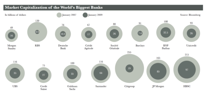
Market Capitalization of the World’s Biggest Banks image sourced from Lecturepod Visualisation Styles: Graphs by Western Sydney University
(Need to be a Western Sydney University Student to access)
Why do we make graphs? To make comparisons easier
The following examples show changes of market capitalisation in various banks in 2007 – 2009 and how much their stocks are worth (That’s what the market thinks they’re worth). The lightest bubbles are 2007, the darker ones are in 2009. We can say over the 2 years, capital decreased in all banks (fall in stock price).
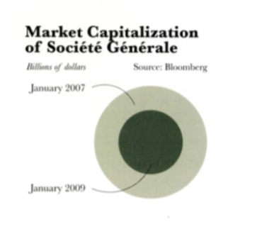
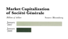
Market Capitalization of Societe Generale image sourced from Lecturepod Visualisation Styles: Graphs by Western Sydney University
(Need to be a Western Sydney University Student to access)
What do you think is the difference between the 2007 and 2009 value?
2007 = $80 Billion
2009 = ?
Market Capitalization of the World’s Biggest Banks image sourced from Lecturepod Visualisation Styles: Graphs by Western Sydney University
(Need to be a Western Sydney University Student to access)
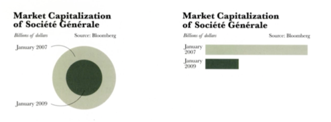
It looks roughly half in a circle chart.
Our brains and our eyes are good at comparing single dimensions e.g. length, but we are not good at comparing surface areas such as height x width. When a bear runs towards you that opposes a big threat, the brain doesn’t waste time figuring out if the bear is tall or wide and that is the hard wired nature of our vision.
You might make a graph wanting your audience to compare area, but what they will ultimately do is compare heights and width because comparing circles are more complicated than comparing squares. So you need to use the formula A = π r2
While the original chart gave us a good overview in the fall of the capitalised banks, it doesn’t give us access to estimate the difference in banks. Using circles will always lead us to underestimate size.
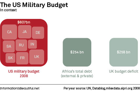
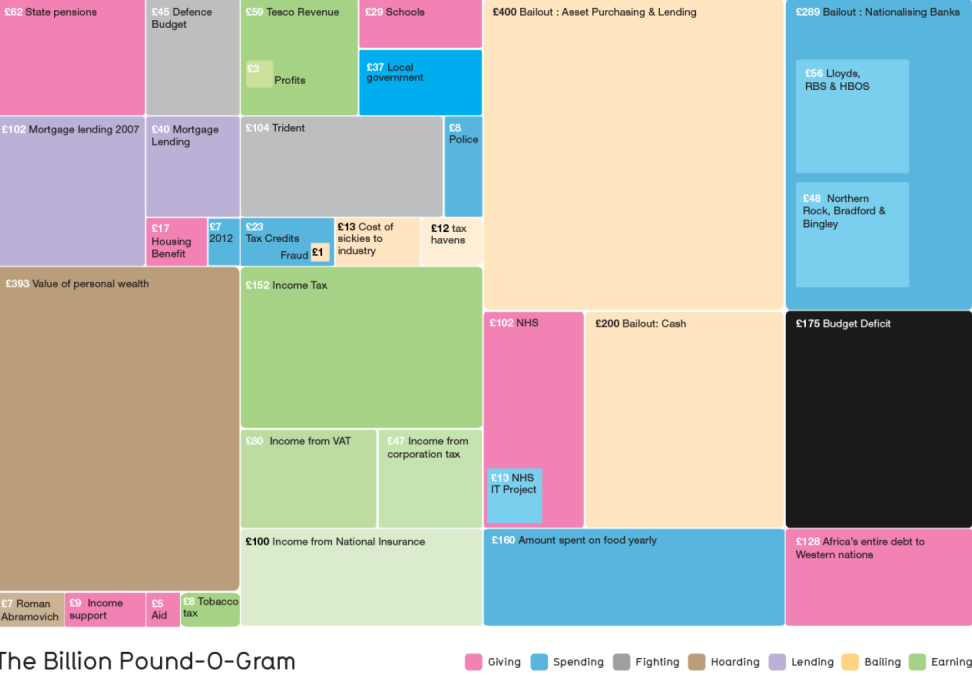
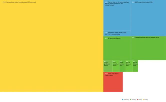 Tree map image sourced from informationisbeautiful.net by David McCandles
David McCandles, Information is Beautiful, 2010, HarperCollins UK
informationisbeautiful.net
Yellow = 780 Billion total cost of financial crisis to the US government
Blue (left) = 500 Billion (New deal, recovery package after the great depression in 1933)
Blue (right) = 823 Billion Nasa’s all time total budget
Blue (Small Bottom) = 150 Million / Martial plan spent to build Europe after WWII in today’s dollar
Green = Other countries bail out for the same expenditure
Red = Africa’s entire debt to the Western Nation
Ranking of different graphic approaches to comparing data
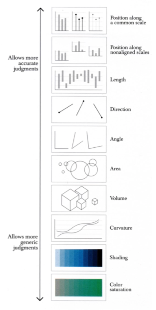
Approaches to ranking graphs image sourced from Lecturepod Visualisation Styles: Graphs by Western Sydney University
(Need to be a Western Sydney University Student to access)
Alberto Cairo, The Functional Art, 2013
Based on human visual perception. We need to tailer the way we show stuff so we are able read easily. The more accurate, the more likely they will take away a correct perception of the patter that you are presenting. This is starting at the top, you can see the arrow saying “Allows more accurate Judgement” to the bottom “Allows more generic judgements”.
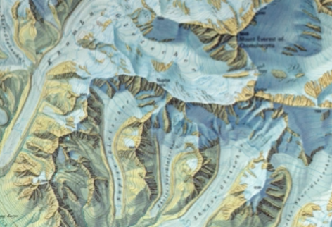
Map image sourced from Lecturepod Visualisation Styles: Graphs by Western Sydney University
(Need to be a Western Sydney University Student to access)
We use shading height as a general indicator for relative comparisons (Saturation). Whereas comparing things like dollar value we need a more accurate judgement – that is why we need to use graphs that compare length.
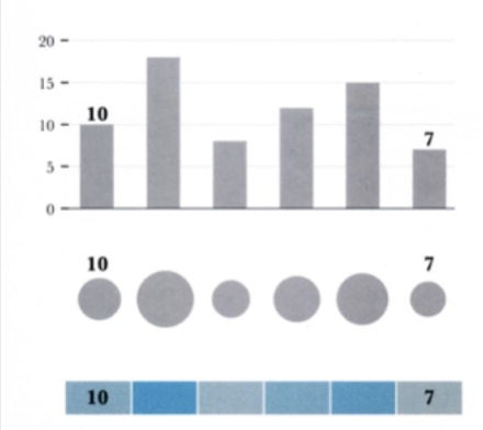
Image sourced from Lecturepod Visualisation Styles: Graphs by Western Sydney University
(Need to be a Western Sydney University Student to access)
The goal is to allow your reader to make accurate comparison. A chart based on line to bars sitting on a single axis beats any form of comparison. These 3 charts have the same data imbedded in them, bar graph, bubble chart, colour saturation scale (10 on the left, 7 on the far right). The bar chart makes a better instant comparison compared to the bar chart assuming we don’t have numbers there to help us, including the shading and tonal value that are so close that we probably can’t tell them apart.
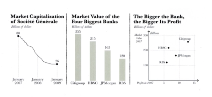
Image sourced from Lecturepod Visualisation Styles: Graphs by Western Sydney University
(Need to be a Western Sydney University Student to access)
Here’s the 3 most common charts you would use
Time series chart (left) Plotting changes over time we often see this in market movement (index over a day or year).
Middle Bar Chart (Comparison with 1 dimension) Comparisons between things (Market value)
Right Scatter Plot: Variable on each axis. Interesting to compare things with multiple variables. In this case we have market value on the vertical axis, and profit in the horizontal. We can see that JPMorgan was more profitable even though HSBC had a better market value.
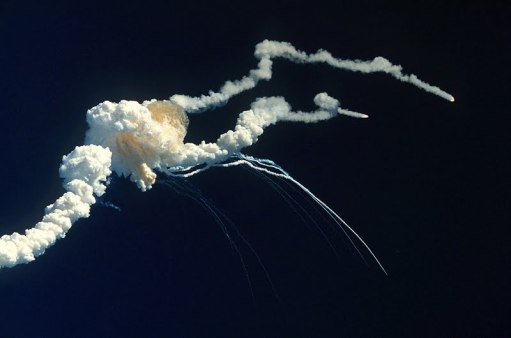
NASA image sourced from Lecturepod Visualisation Styles: Graphs by Western Sydney University
(Need to be a Western Sydney University Student to access)
Here is an example of how using a scatter plot graph could of saved a lot of lives. Here’s a story, leading up to launch day, it had been colder than usual where normally it would be warm. All through the night before the launch, NASA had debates on whether the launch should go ahead in the next day. O-rings sealing the sections of the booster rockets and possibility of it becoming damaged/unsafe. The booster rocket engineers made the first no launch recommendation in 12 years.
Scatter Plot Graph image sourced from Lecturepod Visualisation Styles: Graphs
by Western Sydney University
(Need to be a Western Sydney University Student to access)
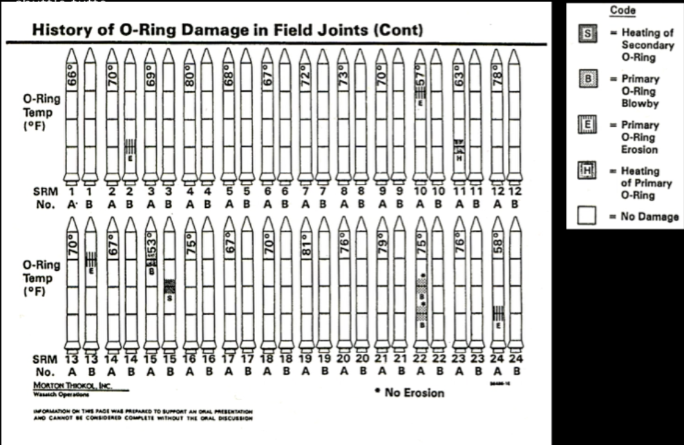
This is 1/13 recommendations. Historical launch order from 1 to 24 of damage to booster seals. This graphic design obscures the 2 most important variables of interest in this case (Relationship between temperature / degree of damage). We see the temperature listed in the nose of the rockets and the degree of damage is listed on the side which is shaded. The rocket engineers decided to order their launch by time instead of temperate and damage.
The booster rocker leaked flames from damaged O-rings the next morning. Edward Tufty took the same data and redrew this in a simple scatter plot data
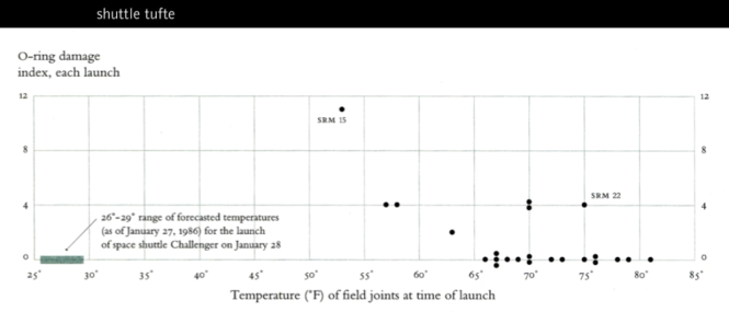
Shuttle Tufte image sourced from Lecturepod Visualisation Styles: Graphs
by Western Sydney University
(Need to be a Western Sydney University Student to access)
This reveals temperate and O-ring damage. Clear pattern of damage, severity as temperate dropped. It shows that there is always damage below 65degrees Fahrenheit. It shows that the temperature on that day is colder than any other launch. If the engineers presented their case in this mode of data presentation, it may have been more convincing.
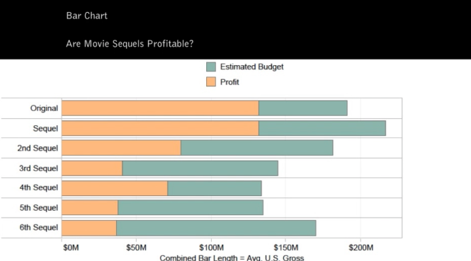
Movie Sequel Bar Chart image sourced from Lecturepod Visualisation Styles: Graphs
by Western Sydney University
(Need to be a Western Sydney University Student to access)
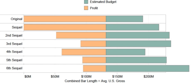
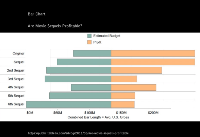
Names of different graph types and what they are used for. This is a classic bar chart. It is used a lot because it is easy to use and people have familiarity with it so it is a big advantage. It makes it quick to compare information, you can reveal high and lows at a glance, you can quickly see trends within the data with numerical comparison. (When you’re comparing data across a category, it’s good to use bar charts). This is looking at movie sequels and budgets compared to profits. The estimated budget if placed first, than profit after, than realign the axis point where the profit and estimated budget meet – this may improve visibility.
Movie Sequel Bar Chart image sourced from Lecturepod Visualisation Styles: Graphs
by Western Sydney University
(Need to be a Western Sydney University Student to access)
Movie Sequel Bar Chart image sourced from Lecturepod Visualisation Styles: Graphs
by Western Sydney University
(Need to be a Western Sydney University Student to access)
Line Chart – Comparing the rise of the terms of commercial art and graphic design starting from the 60’s. These are as popular as bar charts that are frequently used. Line charts connect individual numeric data points. Primary use is to display trends over a period of time. When you’re looking at trends over time e.g. stock price change over a 5 year period. Students often use line charts (error) which indicate a time sequence for a single category instead of a bar chart which make comparisons with categories.
Summary
The selection of visualisation styles can greatly impact on how the audience perceives information to make a good or poor judgement on a topic or area of study. The most familiar form of charts include bar charts, scatter plots, and line charts. People are hardwired to see things in rectangular, linear, and length ways rather than in circumferences or circular spacial perceiving due to how humans have developed over time during our hunter gatherer evolution. The instinct, when a predator runs towards us is to make quick judgements by perceiving forward or up and down. We don’t waste time measuring the size of a predator.
An example of how scatter plots could have saved human lives during a NASA launch in 1986 was in the method of how engineers delivered the information of O-ring failures under cold temperature and conditions. Hierarchy considerations can emphasise the importance of a particular subject and clearly communicate when selecting appropriate visualisation styles to deliver red flags and emergency information.
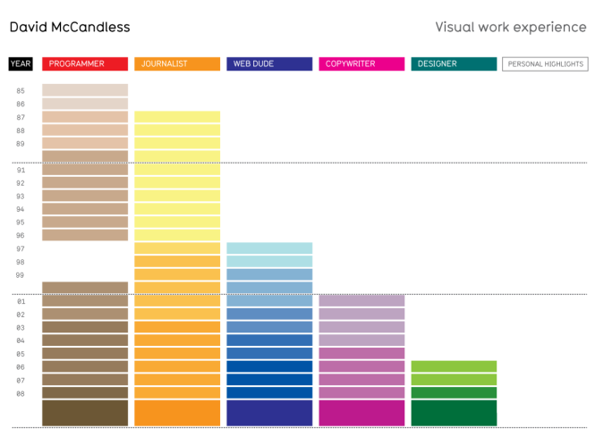 Visual Work Experience sourced from visualising data.com by David McCandless